Triopsi Block Visibility

Triopsi Block Visibility

توسط

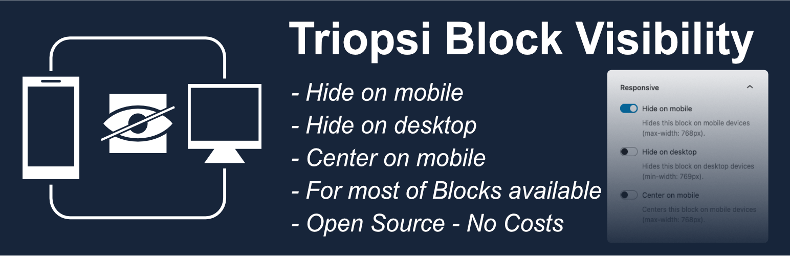
Triopsi Block Visibility extends the WordPress block editor (Gutenberg) by adding responsive visibility controls to every block’s settings sidebar. Control which blocks appear on mobile devices, desktop devices, or both.

Key Features:

  • Hide on Mobile – Hide blocks on screens smaller than 768px
  • Hide on Desktop – Hide blocks on screens larger than 768px
  • Works with all Blocks – Compatible with core blocks and third-party blocks
  • Visual Indicators – See which blocks are hidden directly in the editor
  • No Configuration – Install, activate, and start using immediately
  • Simple Toggle Controls – Easy-to-use switches in the block inspector
  • CSS-Based – Lightweight solution using CSS classes

Perfect for creating responsive designs where certain content should only appear on specific devices. For example, show a detailed table only on desktop while displaying a simplified version on mobile.

Both options can be used simultaneously if needed (useful for draft content or A/B testing).
Automatic Installation

  1. Log in to your WordPress admin panel
  2. Navigate to Plugins > Add New
  3. Search for “Triopsi Block Visibility”
  4. Click “Install Now” and then “Activate”

* Center on Mobile – Center blocks on screens smaller than 768px

Manual Installation

  1. Download the plugin files
  2. Upload the triopsi-block-visibility folder to the /wp-content/plugins/ directory
  3. Activate the plugin through the ‘Plugins’ screen in WordPress

After Activation

  1. Edit any post or page with the block editor (Gutenberg)
  2. Select any block
  3. Look for the “Responsive” panel in the right sidebar (Block settings)
  4. Toggle “Hide on mobile” or “Hide on desktop” as needed

سوالات متداول

Does this work with all blocks?

Yes! The plugin adds the responsive controls to all Gutenberg blocks, including core blocks (like Paragraph, Image, Heading) and third-party blocks from other plugins.

What is the breakpoint for mobile vs desktop?

The plugin uses 768px as the breakpoint:
* Mobile: max-width 768px
* Desktop: min-width 769px

Can I use both options at the same time?

Yes, you can enable both “Hide on mobile” and “Hide on desktop” simultaneously. This is useful for draft content that you want to temporarily hide everywhere, or for A/B testing purposes.

Will this affect my page performance?

The plugin is very lightweight and uses only CSS to hide blocks. There is no JavaScript overhead on the frontend, so performance impact is minimal.

Can I see which blocks are hidden in the editor?

Yes! Blocks with visibility settings show visual indicators in the editor:
* “Hide on mobile” – black dashed outline with label
* “Hide on desktop” – blue dashed outline with label
* Both enabled – purple dashed outline with combined label

Does this plugin create custom blocks?

No, this plugin doesn’t create any new blocks. It adds functionality to existing blocks by extending the block inspector with responsive visibility controls.

تصویری برای این آیتم موجود نیست.
نظری برای این آیتم موجود نیست.
0 0 رای ها
امتیازدهی
اشتراک در
اطلاع از
0 نظرات
قدیمی‌ترین
تازه‌ترین بیشترین رأی
نسخه حجم فایل SHA256 تغییرات دانلود
2.0.0 6 کیلوبایت -
دانلود
×
بدون امتیاز

قیمت:

رایگان

نگارش

2.0.0

آخرین انتشار

17 اردیبهشت 1405

آخرین بروزرسانی

3 ماه پیش

نصب های فعال

-

نگارش وردپرس

وردپرس 6.9+

تست شده از نسخه

وردپرس 6.9.4

نگارش PHP

PHP 8.0+

نسخه ها

1 نسخه